Exploratory Data Analysis
Hasbro Stock Price1
To understand how Magic’s secondary market might influence Hasbro’s stock value, it is helpful to first consider how the stock’s price has changed over the last few years and some of the internal and extraneous factors that have affected the company.
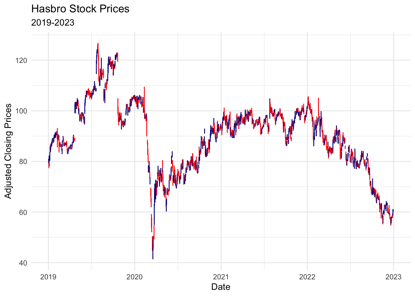
At the onset, it can be helpful to evaluate how the stock has performed over the last several years. In 2019, Hasbro’s stock rose sharply, growing by 50% from ~$80 in the first quarter to ~$120 in the third before correcting back to ~$100, where it hovered until March 2020 and the lockdown protocols in the early stages of the COVID-19 pandemic. Though Hasbro quickly recovered from the initial collapse to ~$40, it took the rest of 2020 to return to pre-pandemic prices. The stock was comparatively static throughout 2021, hovering between $90 and $100 with its largest dip and subsequent rise in the third quarter. 2022, however, proved to be a much more tumultuous year for Hasbro and its subsidiaries.
With this summary in mind, we take a closer look at the Hasbro stock data and transform it into a more useful format so we can use it later on for modeling and forecasting.
Lag Plots
As a first step in our analysis, we examine how correlation between one day’s stock price and another influences the trend of the data series. To better understand the correlation and seasonality that may be present in the stock data, we consider a subset of lagged timeframes.
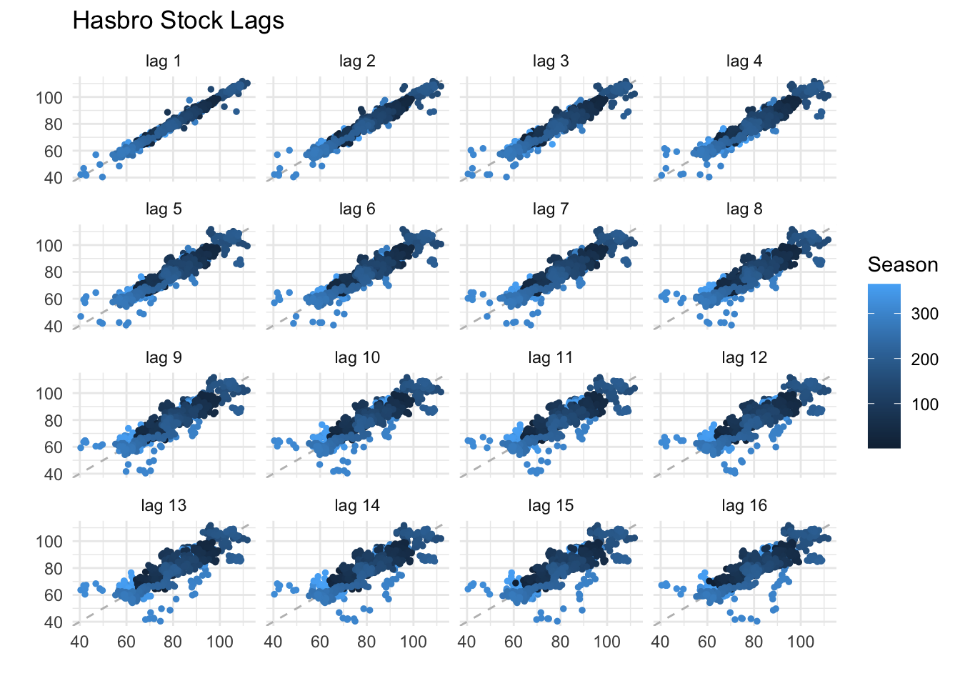
In this plot, each lag represents how well one day’s stock price correlates with the stock price a number of days later. Over the next two weeks, the trend remains roughly linear and correlated. This pattern deteriorates further with each subsequent day. This distortion is to be expected, as many extraneous factors impact the stock. Thus, a given day’s price has less and less influence on a future price. To further test this observation, we also plot lags that are a week apart over the next ten weeks.
Again, the further the lag moves from the original value, the less correlation exists. By week six, the data points look more like a blob of random points than the linear, positive correlation of the previous plot. This pattern also suggests a lack of seasonality in the series as well. We explore this observation in more detail by decomposing the series into its additive components.
Decomposition
We decompose the stock price data to see how the overall trend, seasonality, and random noise uniquely impact the value over time. We observe that Hasbro stock data is additive and deconstruct it using the appropriate parameter, because there is not a change in magnitude of seasonal variance as the trend moves or changes over time.
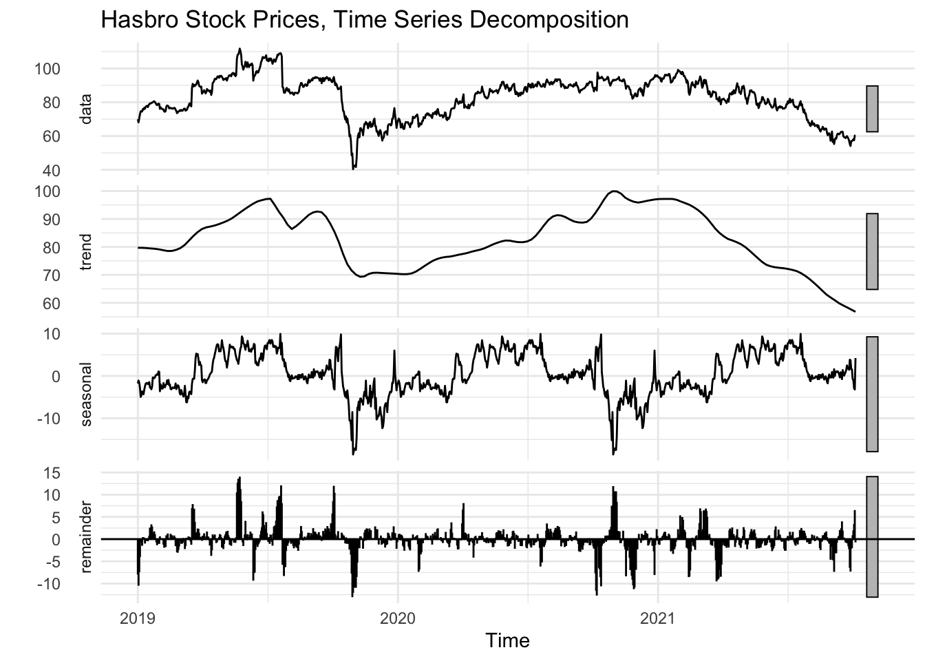
The trend is the strongest component in the decomposition. The plot depicts a sense of seasonality with the uniform oscillating waves, but the range of the y-axis only goes from -10 to 10, implying the impact of this pattern is less influential on the stock’s overall performance, particularly when compared to the randomness shown in the residuals, which swings $15 in either direction.
It is also worth noting the market-wide collapse during COVID-19 lock-down protocols seems to have a strong influence on the seasonal component of the model. The model builds in a larger-than-realistic dip into subsequent repetitions of the seasonal pattern as a result. To compensate, it also includes larger spikes in the residual values to compensate to match the original data and fit the decomposed trend.
Collectively, these observations present a logical set of observations. The long-term trends, both positive and negative, are responsible for the largest component of Hasbro’s stock price movement. Seasonality, in its raw component, has a smaller bearing that likely mirrors the cyclical rise and fall of the market as a whole. The residuals, which account for everything else, can be seen as a sort of “momentum” of the trend’s movements where the intensity of investor confidence or doubt can drive the stock’s price to more extreme values than only the trend or the seasonality would suggest.
Autocorrelation
In addition to understanding how the time series can be split into its various components, it’s important to understand the autocorrelation in the series. Autocorrelation is simply how much values within the time series are correlated with each other. Autocorrelation is common in time series data because the values have an inherent order and are often similar to one another when they are in close proximity. This premise holds true with our stock data, where one day’s closing price is often, but not always, fairly close to the previous and next day’s closing price. Hence these values would be highly correlated with one another. To examine the extent of autocorrelation, we consider the ACF plot and then use a Partial ACF plot to better understand the source of the correlations, as described below.
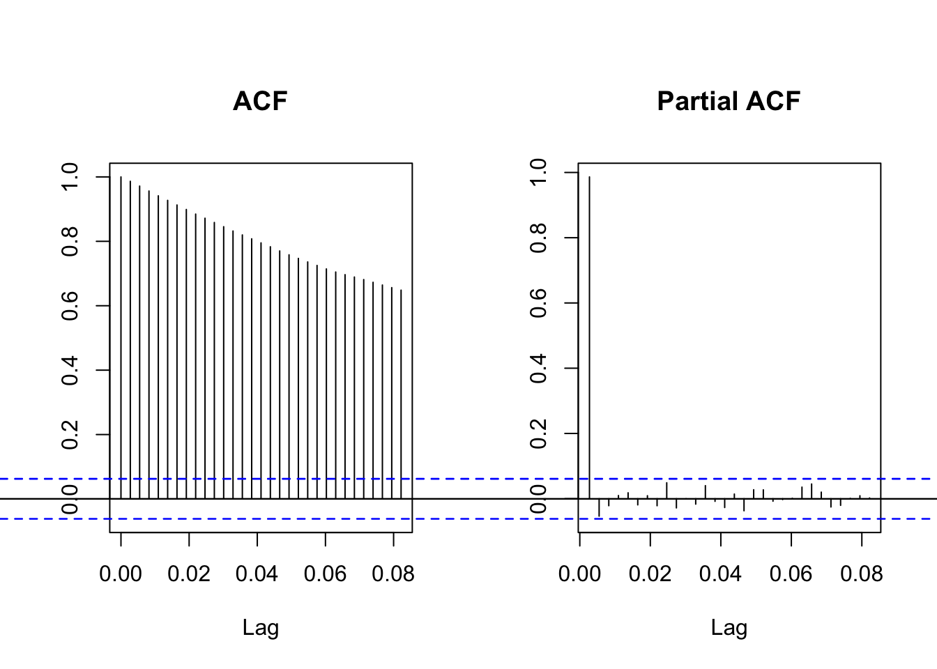
The ACF plot makes it clear there is a great deal of autocorrelation, confirming that the stock value is correlated with itself over time. The positive values show the lags, or future stock prices, are positively correlated with one another - as one increases or decreases, so do the subsequent day’s value, more often than not. This relationship between data points tapers off, however, where a stock price from several days ago has less influence on a future day’s closing price. Even so, the fact that the ACF values are all far above the blue dotted lines, which represent a 95% confidence interval, tells us these results are statistically significant and we can be fairly certain this isn’t just by chance.
The partial autocorrelation (PACF) plot also describes the autocorrelation, but in a slightly different way. The PACF measures the correlation between the residuals - or randomness in the data - with the next lag in the data. We see that the residuals of the lags after the first one are not statistically significant. This plot suggests that the correlation between one stock price and a future stock price isn’t due to the residuals, but rather comes from another component. In this case, the source is likely the overall trend of the stock prices, as suggested above.
Stationarity
These first three tasks have helped us better understand the data. They have also given us clues as to whether the data is stationary, a prerequisite for more in-depth statistical analysis. For a time series to be stationary, it needs to have a consistent mean and variance, meaning it centers around a consistent value and the changes over time aren’t more extreme during one period than another.
From our observations so far, we’ve noted a clear trend over time, a lack of seasonality, and a strong positive correlation between daily stock prices. This interpretation suggests the Hasbro stock price data is not stationary, as it’s average value changes based on company performance and the variance in some years is much higher than others. This intuition is confirmed by a statistical check, the Augmented Dickey-Fuller test.
Results of the Augmented Dickey-Fuller Test
| Dickey-Fuller | -2.25 |
| Lag order | 10 |
| p-value | 0.4719 |
| Alternative hypothesis | Stationary |
With a p-value of 0.4, our results are not statistically significant. We lack sufficient evidence to reject the notion that the data is non-stationary.
Our next task, then, is to transform the data into a stationary format.
Differencing
Because the above dataset in its current form is not stationary, we use additional data transformations to make it more suitable for modeling. We difference our data, which transforms the time series into the change between each consecutive data point. Mathematically, this process is similar to a derivative, which calculates the rate of change of an equation. The first-order differencing helps reduce a trend if the underlying trend is linear, which is the case for our financial time series.
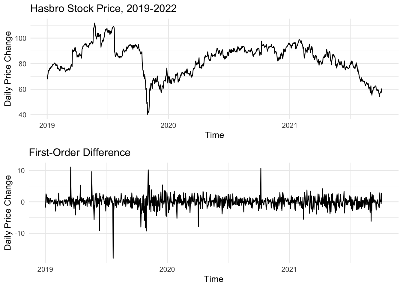
In this case, the plot of the first-order difference shows us the daily change in the adjusted closing price of Hasbro stock from one day to another. We can verify the underlying math with a quick look at the most dramatic changes in price and compare it to the plot of the raw data above. We see the spikes and dips in the first order difference line up perfectly with dramatic shifts in the stock price, whether it was the phenomena of the COVID-19 pandemic in March 2020 or growth and subsequent correction in 2019.
We then reconsider the ACF plot, this time comparing the autocorrelation of the original data with the new first-order difference series.
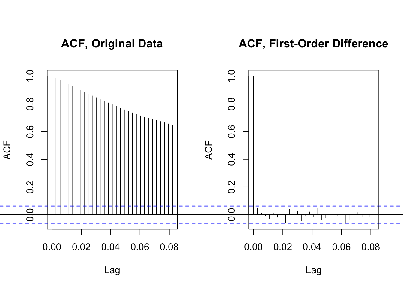
The final results highlight the power of the differencing transformation. Whereas the autocorrelation of the original data is consistently present and highly varied, the ACF plot of our first-order difference data is much more in line with the requirements for a stationary series. While a small handful of the points go above our confidence interval threshold, it is clear this is a step in the right direction.
Moving Average2
In closing, we return to the prior candlestick plot of Hasbro’s stock performance, this time focussing on only 2022 and early 2023. In adding a series of moving average lines, we can see both the trends based on different time horizons and indicators of noteworthy changes. The first moving average is a five-day window, which tracks quite closely with the individual candlesticks for each day’s closing price. The second moving average is the 20-day average, which captures a month’s worth of trading days. In comparing this slower trend, we can see points of overlap that may indicate shifts in the stock’s trajectory. A simple example of this event is on January 19th, where the MA5 crosses under the MA20, meaning the more recent trend is moving downward and in the subsequent trading days, the stock drops notably before reversing and the MA5 crosses over the MA20 a month later on Februrary 14th.
This process of tracking the crossings of various moving average lines is a popular trading strategy within technical analysis for predicting stock movements. One shortcoming of this procedure, however, is that it can be slow to move as the directions of the stock price shift. We see an example of this concern when introducing the MA50. For much of the year, the MA50 serves as a resistance for the MA5 where the MA5 approaches the MA50, but drops off before crossing. When it does cross, it is often for short stints and not particularly dramatic changes. In late April, for instance, Hasbro’s MA5 crossed the MA50 around $85 before rising to $89 and then dipping back towards $80. If an investor had purchased stock when the cross-over took place, they would have already missed most of the gains, given that the stock’s direction had changed two weeks earlier when it bottomed out at $80 the first time that year. A similar pattern plays out in January 2023 when the MA50 and MA5 cross-over event does predate further positive momentum, but only happens halfway through the upward movement as a whole.
Finally, we introduce the MA200. If nothing else, it serves as a clear indicator of the negative trendline identified during the decomposition process. The MA200 only intersects one other moving average the entire year when it crosses over the MA50 on March 17, 2022. Considering the time horizon of these two pieces, it should not be particularly surprising how the rest of the year played out. On this date, the MA50 and MA200 were roughly $91, while the stocked closed at $84. While the stock would close above $84 in brief positive drives throughout the year, it never again approached the MA200 and largely saw the MA50 as a resistance, as noted above.
Combined, these four moving average lines provide a clear picture of the challenges Hasbro faced throughout 2022 as well as both the potential and shortfalls of the moving average technical analysis strategy. Further analysis will consider how modeling and forecasting might improve upon these techniques.
Conclusion
We first explored our data by looking at how Hasbro’s stock value has changed over the last several years. We then used lag, decomposition, and autocorrelation techniques to better understand the underlying data. When we determined the data was not stationary, we used differencing to center the data around a consistent mean and mitigate the variance. We then considered how moving average analysis might provide further insights into Hasbro’s stock performance. The result is a stationary series that represents the daily change in Hasbro’s stock price and is ready to be used in statistical analysis to potentially outperform the moving average technique.